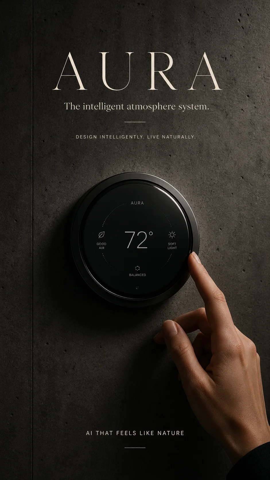
A smart home product that doesn't exist. Developed in one day, from the visual reference to the website, to test whether a product world holds up before anyone builds it.
Rapid PrototypingProduct DefinitionIndustrial DesignAI ImageWebsite conceptContent system
1day from reference to product world
2product forms tested, one discarded
2website pages: home page and product page
9carousel slides, each generated individually
Overview
Build the world first. Then test whether anyone wants to step into it.
AURA is a fictional premium device that brings a room's temperature, air, light, sound and energy together in one interface. No real product, no real sensor. A rapid prototyping experiment with one clear question:
Can a credible product concept with a website, product page and carousel story emerge from a visual reference in a short time?
My part: product idea, positioning, feature logic, art direction, every single image decision and the content system. The AI generated, I selected, discarded and refined.
Reference
Translate principles, don't copy.
The starting point was a smart home reference with brutalist architecture, dark concrete, misty forest, an elegant serif and a round wall interface. The goal was never to rebuild it, but to create a product of my own with comparable visual quality.
That's why the imagery didn't come from one big prompt but from reference images and individual shots: concrete, glass, matte black, cinematic light. No neon, no cyberpunk, no gadget look.
Graphite#151514
Concrete#3A3936
Forest green#2F3A2E
Off-White#EFE7DC
AaElegant serifHeadlines and wordmark
AAUppercase labelssmall, with generous tracking
Product
Not a thermostat. An atmosphere system.
It started with a smart thermostat. That was too small. The stronger frame: a system that brings together all the invisible comfort factors of a room. The category changed everything, including the images.
Not
Smart Thermostat
Temperature controller
Gadget
Single device
But
Atmosphere Intelligence Hub
A system for how a room feels
Architectural wall interface
Air, light, temperature, sound and energy in one
The problem space came from everyday life: rooms often don't feel right, but the cause is hard to pin down. Every problem became a feature.
Bad airAir quality, CO₂ levels, ventilation prompts.
Wrong lightLight scenes for focus, sleep, recovery and hosting.
Too many appsOne interface, whole home: heating, lights, blinds, speakers, Matter.
Privacy concernsLocal processing, no camera, your data stays with you.
Wasted energyAn eco mode that balances comfort and consumption.
Disturbing noiseSound level at a glance, quiet mode at the push of a button.
Short promise: AURA makes atmosphere controllable. Claim: The intelligent atmosphere system.
Form
The final form wasn't the first prompt.
I tested two directions: a round wall interface and a triangle with rounded corners. The triangle was interesting but looked distorted in perspective and didn't create the same calm. It was out.
What stayed is a round, matte black device with slightly domed glass like a watch. On the display only the essentials: 72°, plus air, light, humidity and energy.
The most important rule behind it sounds trivial and saved every image: “perfectly circular and front-facing”. Without that sentence, image generation turns the circle into an ellipse.
Product shots from a second round in August 2026, same device, new settings.
Website
Shot by shot instead of one page from one prompt.
Instead of generating the whole website with one prompt, I controlled every element individually: hero visual, product shots, interface, use scenes, mockups, ad visuals. Only that way could every detail be controlled.
The home page tells the mood: the device on the concrete wall, forest behind glass, “Designed to disappear. Built to belong.” The product page explains: interface, sense, learn, adapt, modes, ecosystem, privacy and specs.
aura · home page
Home page as a long-scroll mockup.
aura · AURA One
Product page: explains what the device can do.
Layout learning: dark sections carry the atmosphere, beige sections the explanation. The beige ones stay compact, otherwise they get heavy.
Nine slides, one story.
Carousel
The product page became a carousel of nine slides in 3:4: hero, interface, how it works, modes, ecosystem, privacy, material, specs, closing. Each slide generated individually, because batch prompts like to produce collages or 3×3 grids.
Global carousel prompt
One slide, not nine.
Create ONE single premium editorial product slide in 3:4 format. No navigation. No website menu. No header links. Only one standalone slide. Do not create a grid. Do not create a collage. Important product rule: The device must stay perfectly circular and front-facing whenever the interface is visible. Show the product as a true circle, not an ellipse.
Learnings
Find out faster whether an idea holds up.
A fictional product needs a clear category“Atmosphere system” is stronger than “thermostat” and steers every further decision.
Product framing comes before visualsThe claim determines the imagery, not the other way round.
Round products need hard constraints“Perfectly circular and front-facing” belongs in every prompt.
Website isn't carouselThe website may have navigation, the carousel better not.
What AURA isn't: a tested product. There were no user tests, no sensors, no shop. The next step would be a landing page as a fake-door test to measure real reactions.
For me, rapid prototyping doesn't mean making pretty images faster, but understanding faster whether a world emerges that people understand, feel and want. That's exactly the process the Rapid Prototyping Canvas walks you through, block by block.